L’Oréal
Design a subscription-based approach to reach professional stylists through targeted email campaigns.
Each email featured a strong, well-structured layout to create the feel of personalised content and exclusive deals, tailored specifically for industry professionals. By delivering consistent, weekly emails, the campaign aimed to build stronger, long-term relationships within the stylist community
Client: L'Oréal
Sector: Retail
Category:Design + Code
Design: Figma, Adobe Photoshop
Development: HTML5, CSS3 (inline), Litmus
HTML email:
I designed and developed email format, built in HTML5 and CSS3. Each template adhered to L'Oréal brand guidelines, ensuring a consistent across all desktop and mobile devices with A/B testing.
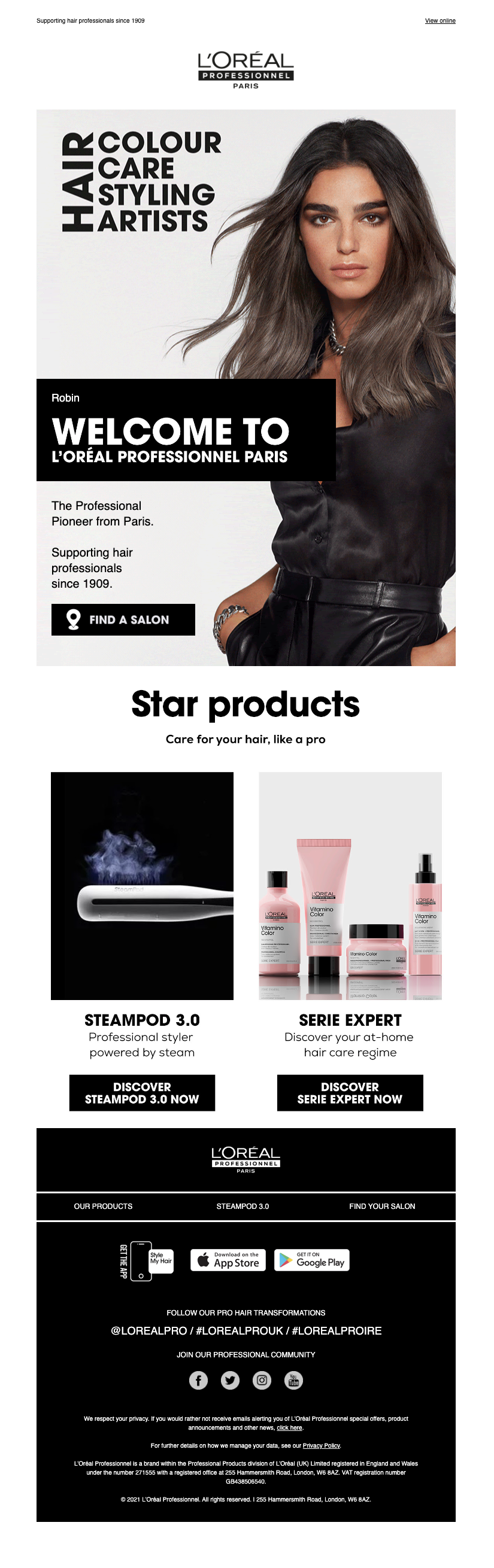
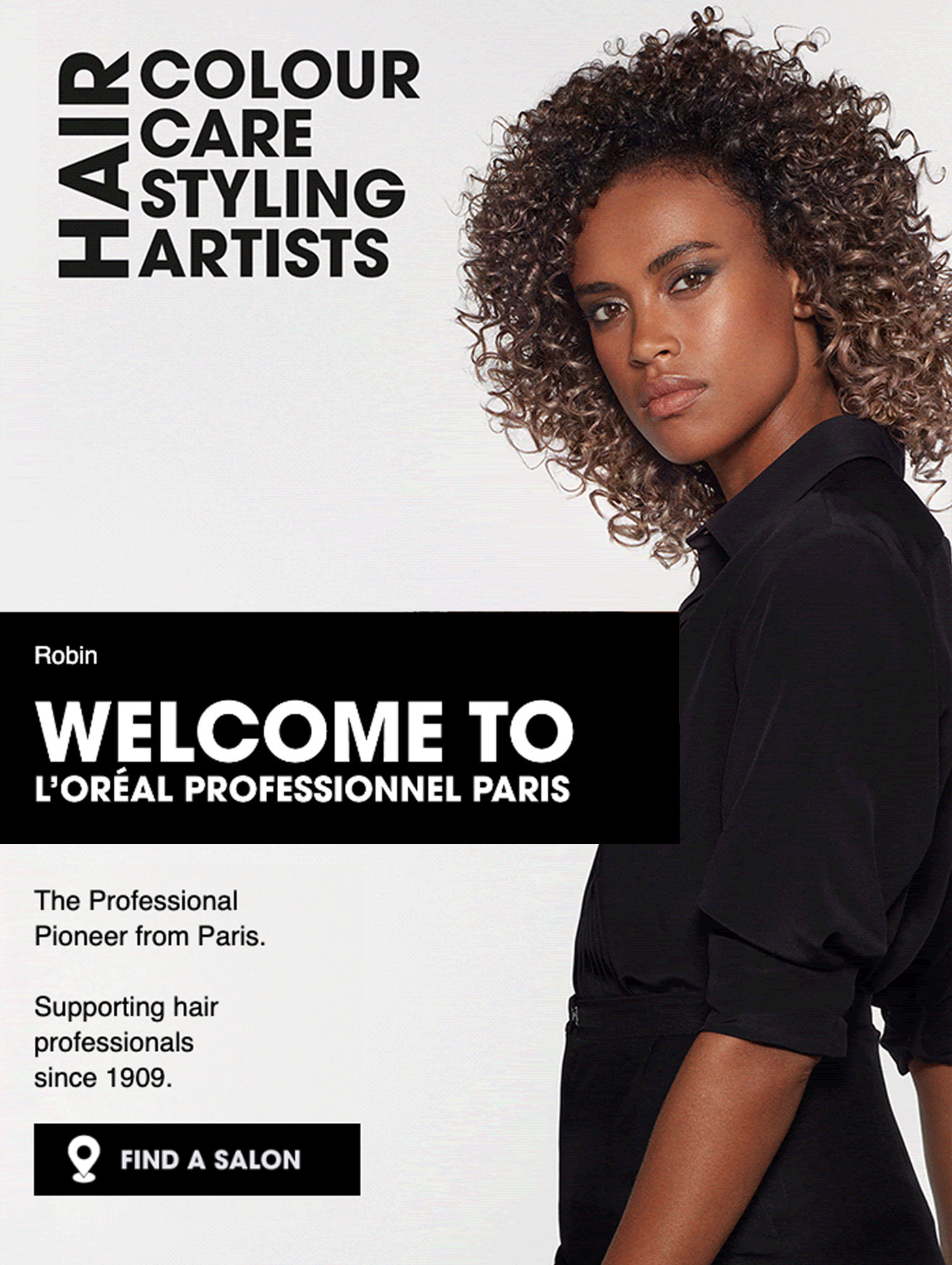
Animated background:
The hero layout featured an animated background, designed to create an engaging and dynamic first impression. The background animation will include visually appealing graphics that add depth and motion, drawing attention to key elements of the page.
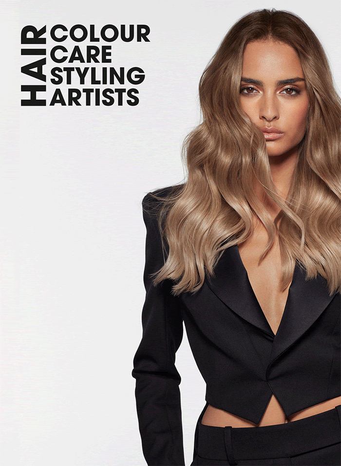
Hero with overlaid text:
Overlaid on top of the animated background, live text will display relevant information or headlines, which may change or animate in response to user interactions or as part of the overall visual effect.
Hero layout - 1

Hero layout - 2

Hero layout - 3
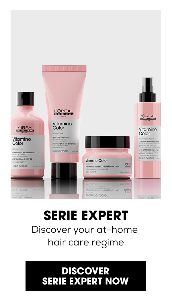
Card based layout:
The product layout is based on an image-based card format, where each product is showcased within a clean, visually appealing card design. Each card features a high-quality product image, allowing customers to easily view the product at a glance. Below each of the images, essential details such as the product name and a strong call to action button.
Grid layout
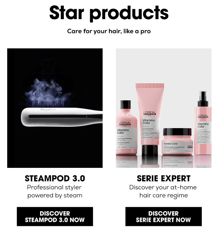
Card 1, image/text/cta button

Card 2, image/text/cta button
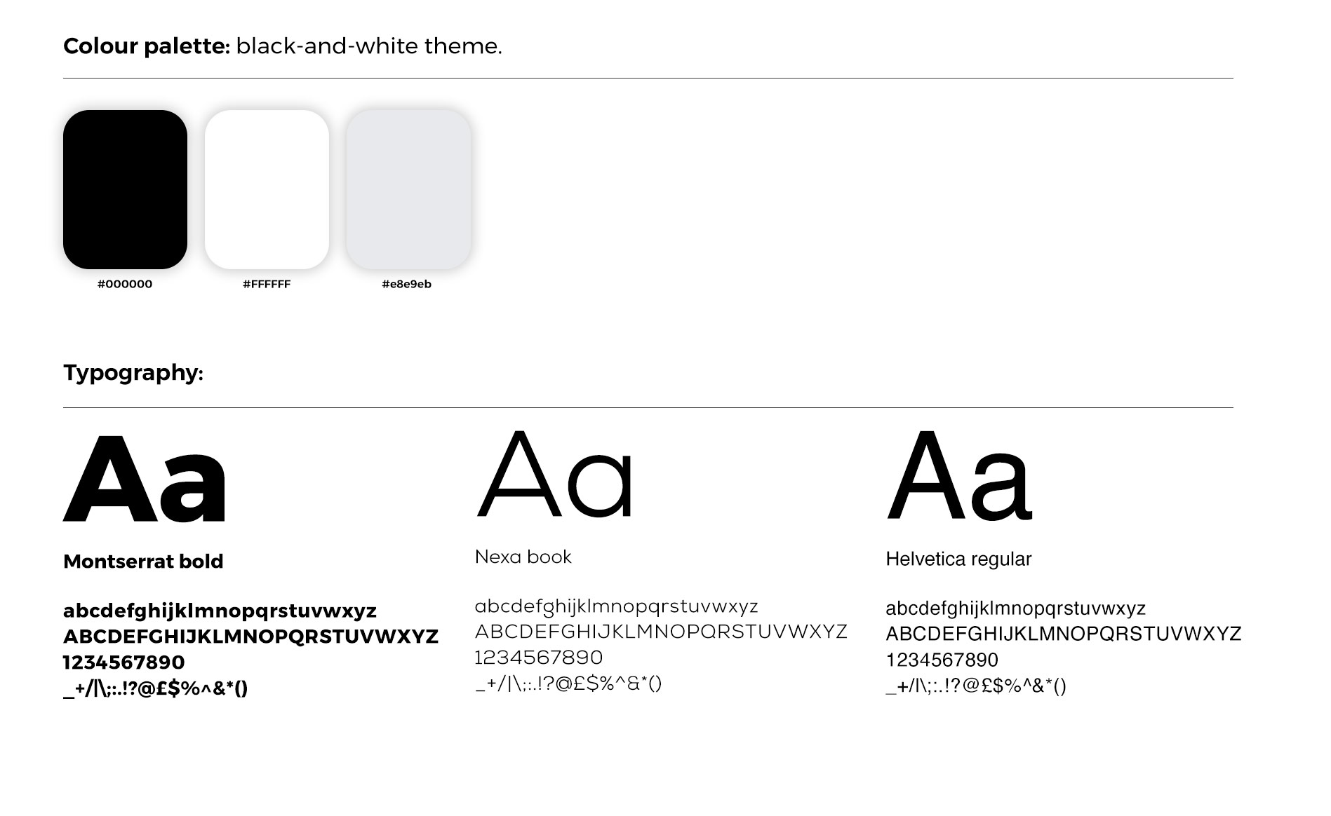
Email style guides:
Typography
Following brand guidlines I used Montserrat for headers and cta
buttons to create a
bold, modern, and clean
aesthetic. For subheaders, I use Nexa Book, providing a sleek and professional contrast
that enhances readability. Helvetica is used for
Colour palette
a strong black-and-white theme, creating a bold and modern aesthetic. To balance the contrast, I use light grey backgrounds for product displays, ensuring a clean and sophisticated look while maintaining clarity and focus. This minimalistic approach enhances readability and provides a sleek, professional feel.